How to Graph Chart in Numbers Mac
I bought a new Macbook air for myself. I didn’t buy Microsoft Office for my Mac. I thought it sucked anyways. But I still have to use my Mac to create charts for my project documents, especially the multiple line charts. So my only option is to learn how to create a chart in Mac Numbers.
It wasn’t so hard. If you want to learn how to graph charts in Mac Numbers, you should check out the tutorial below. The tutorial focuses on the line chart. But other charts work in a similar fashion. You will be able to use them all.
How to insert a chart in Mac Numbers?
The first task is to know how to insert a chart into your empty spreadsheet. To do so, click the “Chart” icon. A list of charts appears. Then click the chart that you want to use in your document. In my case, it is the multiple line chart.
How to add a series to the Mac Numbers chart?
In case you are brandnew to the chart game and wonder what a series is, a series is simply the data you want to visualize. For example, each line on the line chart is a series. Each set of bars of the same color is a series in the bar chart.
But you must put your data in the same line or in the same column, one value right next to the other, in order to form a series. This step is a must before you tell your chart to graph a series.
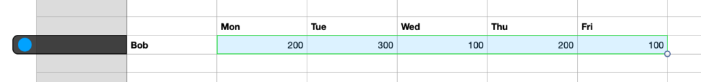
The example below is a series of Bob’s spending in a week. Notice that the numbers are on the same line.
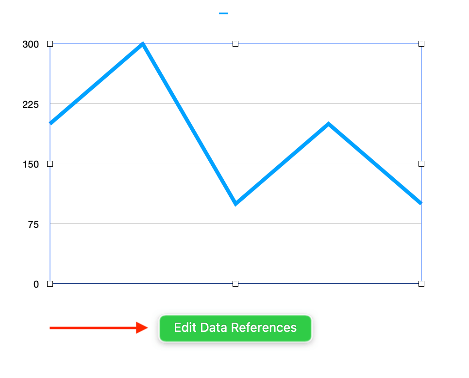
Now you click the chart, then click the “Edit Data References” button. Then select the line or the column representing your series. And click the “Done” button at the bottom of your screen.
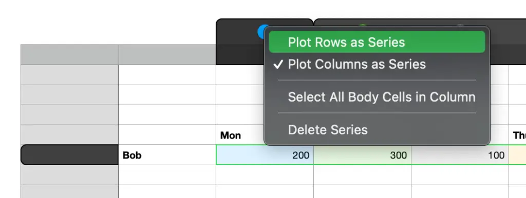
By default, Mac Numbers assumes each column is a series. But you can make each row a series. Click the circle with color. Then select Plot Rows as Series.
How to edit Numbers chart horizontal axis (X Axis)?
At this point, you don’t see any label on the horizontal axis of the chart. If someone looks at your chart, and the person doesn’t know your data, he or she doesn’t understand it.
So you want to add the labels to the horizontal axis. Each data point needs a label. In my example, the label for the first data point is Monday. It means the money Bob spends on Monday. Then the labels for the next data points are Tuesday, Wednesday, Thursday, etc
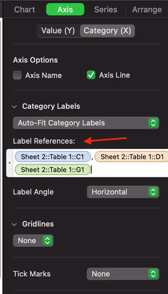
By default the chart uses the dark column for reading labels. But you can change that. First click the Axis tab, click Category (X), then click Label References. Delete all the content in the Label Reference. Then select a column or a line which has your data labels. Hit Enter when complete.
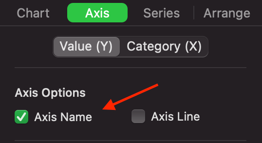
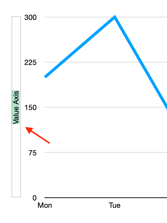
How to edit Numbers chart vertical axis (Y Axis)?
In the example, the vertical axis shows numbers like 200, 340, 500. No one knows they are money. Perhaps a title will help. The good news is that you can do it.
First, click the Axis tab, then click the Value (Y) tab, and tick the Axis Name check box. The last step is to double click on the title and change it.
edit Numbers chart vertical axis Y Axis
And that’s it, my friend. Now you know exactly how to set up a line chart or any chart in Mac Numbers.