Wix One-Page Scroll: the Only Guide You Need
Once upon a time when the world gave birth to the internet, no one knew what one page website was.
But the world has changed a lot since then. Websites are widely used nowadays. There is a website for every task you can think of. But one type of website doesn’t fit all. That is why the familiar, popular multiple page websites are replaced by the lighter and more responsive one page websites in some areas.
And you are thinking about creating one page website for your business. You are in the right place. Look no further. The below tutorial will reveal the secrets and the step-by-step actions so that you can create a stunning website by yourself. I use Wix in this tutorial. The steps are below.
- Single Page vs Multiple Page Website
- When to Use Single Page Website
- Single Page Website Inspiration
- Prepare Your Content
- Choose a Template
- Pick a Color Scheme
- Separate Your Content into Sections
- Create an Anchor Navigation Menu
- Add Back to Top Button
- Add Parallax Effect
- Strong Call-To-Action
- Enrich Your Site Footer
- Make sure Your Site Work on Mobile Devices
- Improve the Loading Speed
1.Single Page vs Multiple Page Website
Just like multiple page website, the single page site isn’t a solution for all the problems. It works in many situations. And it fails in other situations. To avoid wasting time and effort, you must know if the site fits your goal before you build it.
There are two types of websites out there: single page websites and multiple page websites. What is your goal? What type of website will best serve you? Let’s look at both of them.
Single page website has only one page. When you navigate through the site, you don’t jump to a new page. You simply scroll up and down to a section of the page. Scrolling is fun. But too much scrolling is annoying. That’s why you must keep your content short and sweet on those single pages websites.
Unlike the single page sites, the multiple page websites break down the content into multiple smaller pages. You don’t have to scroll that much on each page. Multiple page websites are excellent at holding a large amount of content. The large content is well organized, but capable of distracting your site visitors from doing what you want them to do.
Therefore, the single page website focuses on a small area and tries to achieve a small goal. The multiple page website works better on bigger niches, but makes it easy for your visitors to navigate away from your Call-To-Action.
2.When to Use Single Page Website
So here it comes. The million dollar question. When do you use the single page website? If you can answer “Yes” to the three questions below, the single page website is the right choice for you.
Does your content consist of a small amount of text and a larger amount of images?
“A picture worths a thousand words”. It means people prefer pictures to text. Single page websites tap into this human psychology. Therefore, the main ingredient of the best single page websites out there are well organized eye-catching pictures to tell a story. Then sprinkle a small amount of text on top to make the idea clearer.
You must keep that composition in mind when you build your one page website. If your requirement diverts too much from that composition, stay away from single page websites.
Do you have a single narrow objective for your site?
To explain the point I need some of your imagination. So now imagine you use single page website to build a blog. Each blog post has about 1000 words on average. You have 50 posts. That means the visitors must scroll through 500 lengthy sections before they reach the end of the website and subscribe to your blog. How unpleasure the experience is!
Obviously, big goals are not good for single page websites. Single page websites are for small objectives. For example, build a landing page, in-depth single product/service review, tell a single story, display a profolio, or promote an event. You can tell those objectives are very narrow and laser focus on that one thing.
If your goal isn’t so big, and you think you can achieve it with a small amount of content that fits into one page, then the single page website is the choice for you.
Do you have non-SEO traffic source to your site?
SEO works best on the long text content like blogs. Simply because there are more key words in the long text content to rank for. This is bad for the single page websites. They have too fewer words to be ranked high by the search engines like Google. This means you won’t get much traffic from the search engines. There are a few things you can do to improve SEO of your site. But the progress won’t be significant.
Fortunately, there are alternative traffic sources like social media, youtube, paid ads. If you can harness the power of those traffic sources and can afford to ignore SEO, you don’t have to give up your idea of building a one page website.
3.Single Page Website Inspiration
Theory is confusing. It doesn’t give you a clear picture of what your site would look like in the future. So, let’s take a break from the theory and look at the real life examples below. They will give you some inspiration to create your own masterpiece.
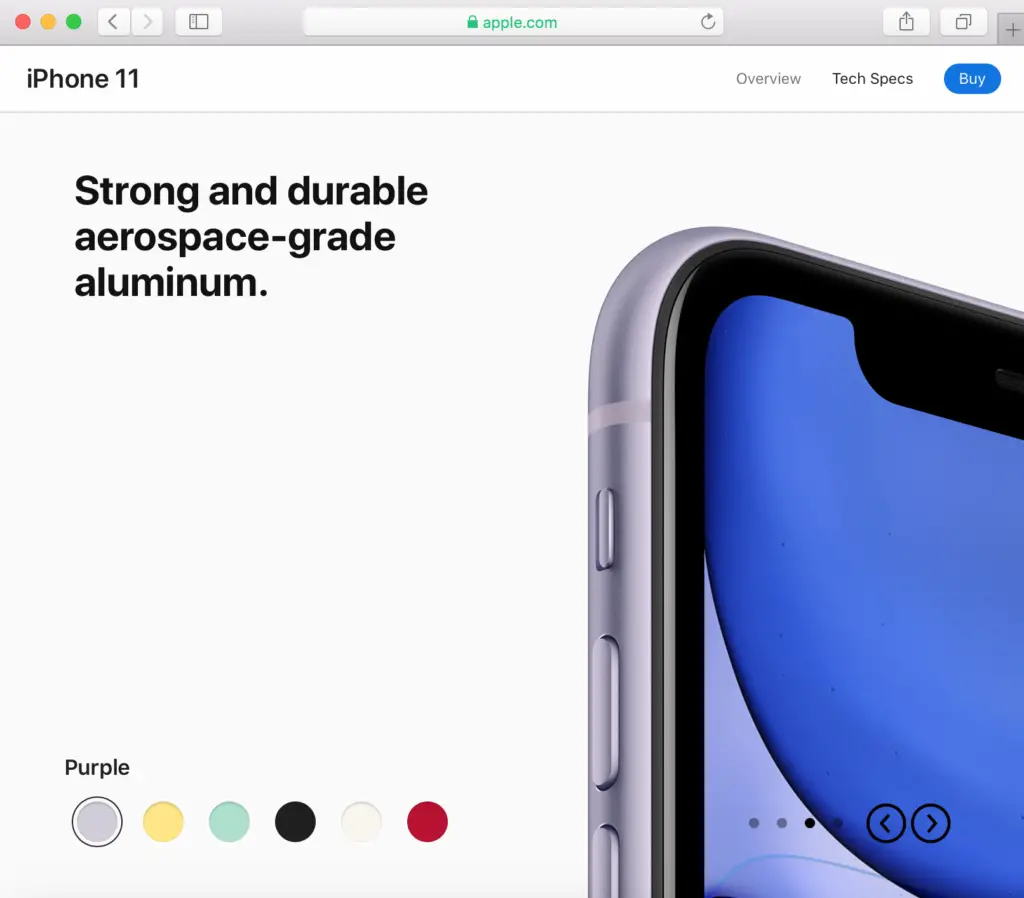
The first example is Apple website. You may think I am crazy. Apple website isn’t a single page website. But hear me out. Apple marketing team is so clever. They build a single page website for each product. Judging by the amount of phones they sell, their pages must do well. It proves that the multiple page site and the single page site are not mutual exclusive. They can work together if you organize your website correctly.
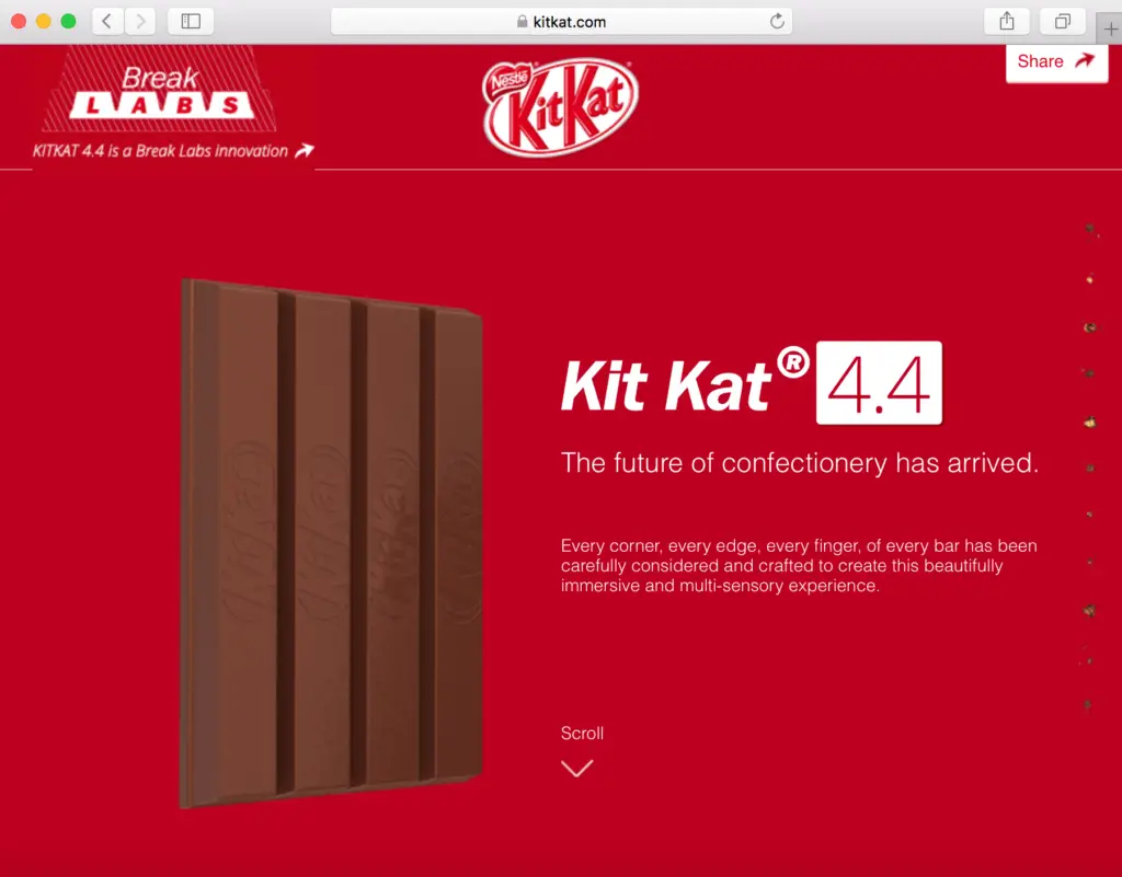
Another excellent one page website is KitKat. The whole site focuses the visitors’ attention on one product only. The amount of text is kept to the minimum. But the text is clear and concise. It lets the background pictures tell a story about the product development.
4.Prepare Your Content
The technical work to build a website is fun… only if you have your content ready. Then you simply drag and drop the pictures and the texts to your web page, change their colors, move them around until they look pleasing to your eyes. Then you publish your site. It is very simple!
But without the content, you will have to stop your technical work multiple times to create the content. You will multi-task a lot. I can tell you in advance it’s not fun. Your brain will be in a very messy state. Therefore, prepare your content before you build your one page site.
Below are a few tips to help you create better content for one page site:
Tip 1: Have a crystal clear objective for your site. You must know what you want your site visitors to do. For example, subscribe to your newsletter, buy a product, click on an affiliate link, or sign up for an online course. And write down your objective. Later on, you will turn this objective into a strong Call-To-Action on your site.
Tip 2: Write your site content like writing a story. Each scrolling leads your visitors deeper into a different part of that story. For example, you create one page website to promote a product. Then your site is a story of that product. The first section is about how the product was born. The second section is how the product was improved to serve its consumers better. Then you move on to show positive customers feedback. Finally, you ask the visitors to perform an action. Hope you get the idea!
Tip 3: Read your story and think about pictures that would tell your story better. For example, instead of just saying that camera takes stunning pictures, you display the real stunning pictures taken by that camera.
Tip 4: If possible organize your content in zig-zag layout. Why is that? Because it follows the natural movement of the eyes. It makes it very easy to follow your content from the beginning to the end.
5.Choose a Template
The greatest advantage of using website builders like Wix is that you don’t have to create everything from scratch. There are plenty of website templates for you to choose from. You just pick one template, change a few things. Then your website is ready within one afternoon.
Most templates on Wix have a nice blend between a multiple page website and a single page website. That means the website template has multiple pages, but each page has the characteristic of a single page website. Those templates work just fine if you like them. In the list below I only list the strictly one page website templates on Wix.
Business & Services
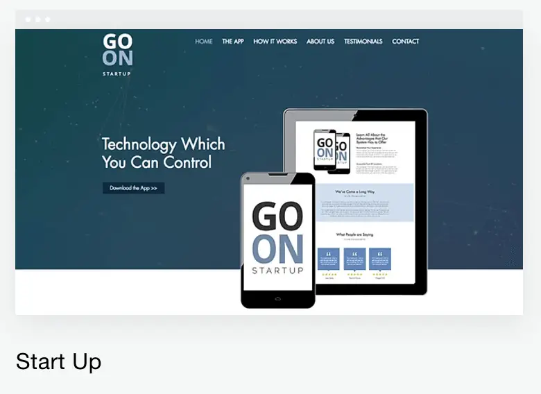
Technology & Apps
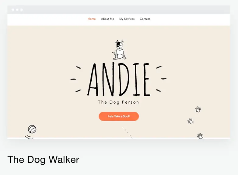
Pets & Animals
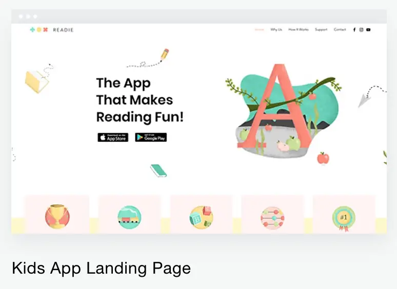
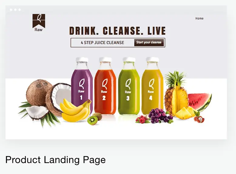
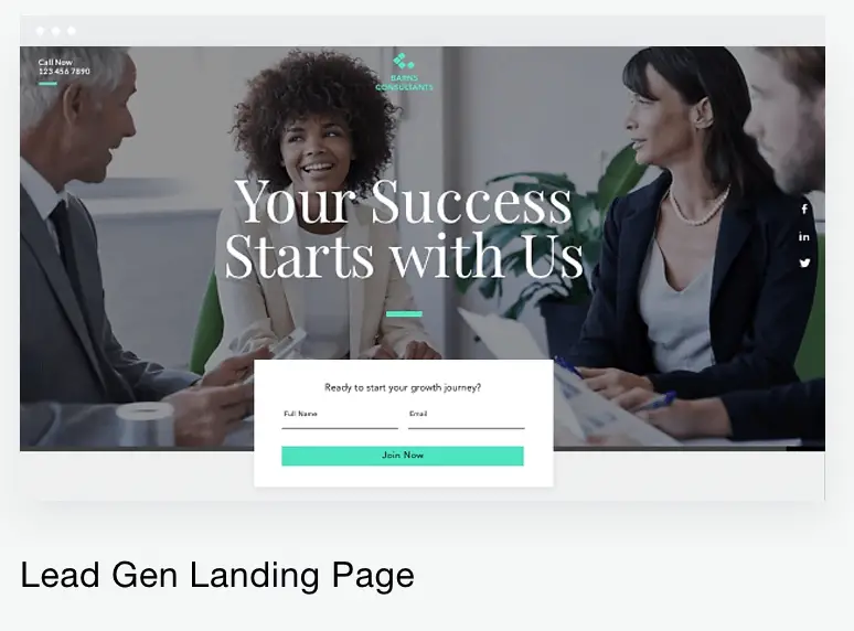
Landing Page
6.Pick a Color Scheme
The next step is to choose a color scheme for your website. You may ask, “Why bother?”. Because the lack of consistency and the random use of colors will turn your website into a mess. It’s very difficult to build trust and a brand when you have a messy website.
Plus, you are not a graphic designer. You don’t know which color works well with the other. The trial and error takes forever to figure that out. To avoid some frustration, you pick a set of colors that always go well together. And you use them everywhere in your website.
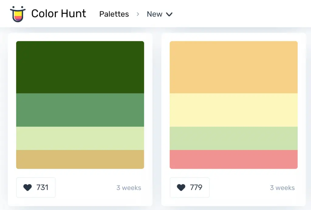
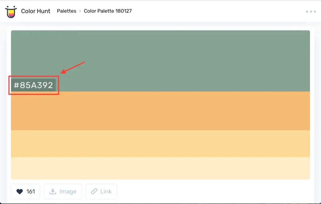
The designers of each template have already chosen the color scheme for you. If you are please with the template colors, try to use the same colors on your new content. If you happen to like the layout only and wish to use totally different colors, then you go to this link and pick a color scheme. Remember to take note of the color values in the scheme (Those values start with # character).
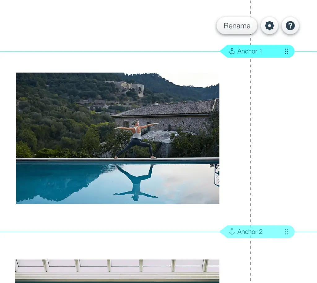
7. Separate Your Content into Sections
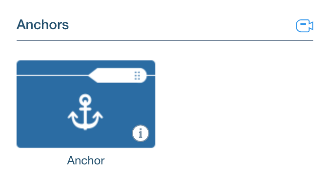
The single page website is divided into multiple sections. Website builders must know exactly where the section borders are in order to navigate to that section with just one click. In Wix, you use “Anchor” to tell this line is the end of the previous section and the start of the new section. Later on, you can program your web page to jump to an anchor instead of jumping to a new page.
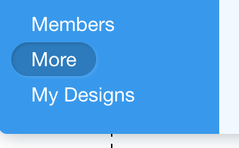
To add an “Anchor” to your Wix site:
- Click “Add” icon
- Select “More”
- Select “Anchor”
- Click on the anchor
- Drag the anchor to the start of the section
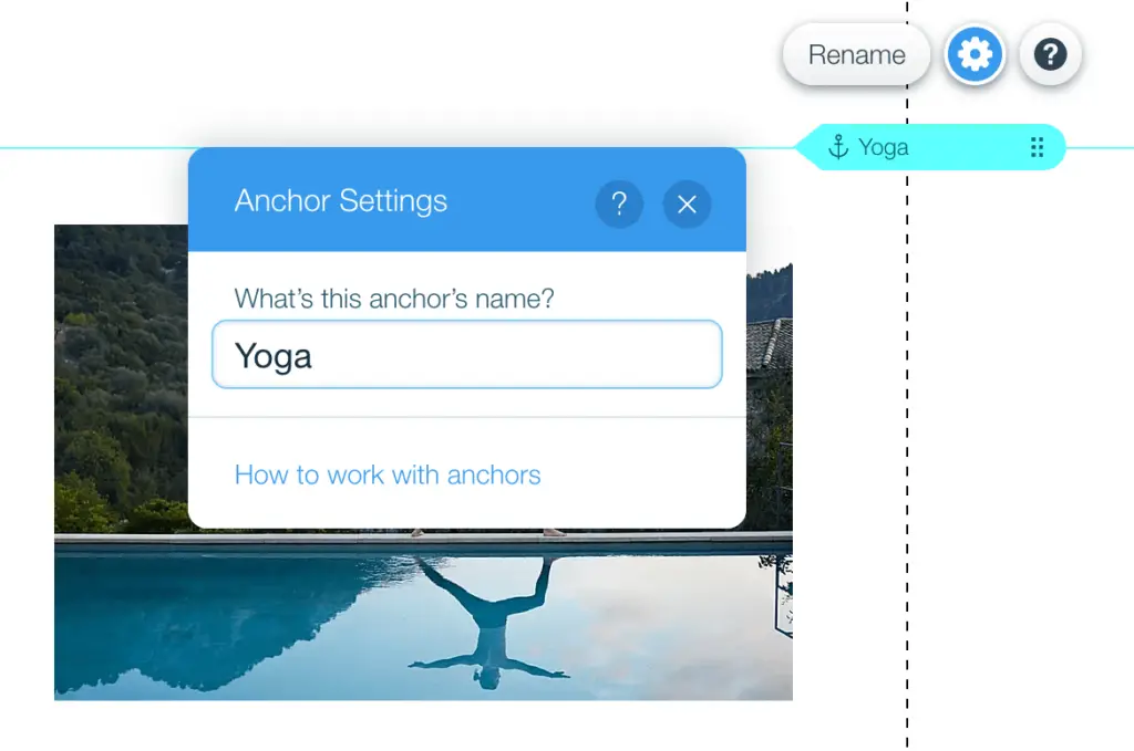
- Rename the anchor

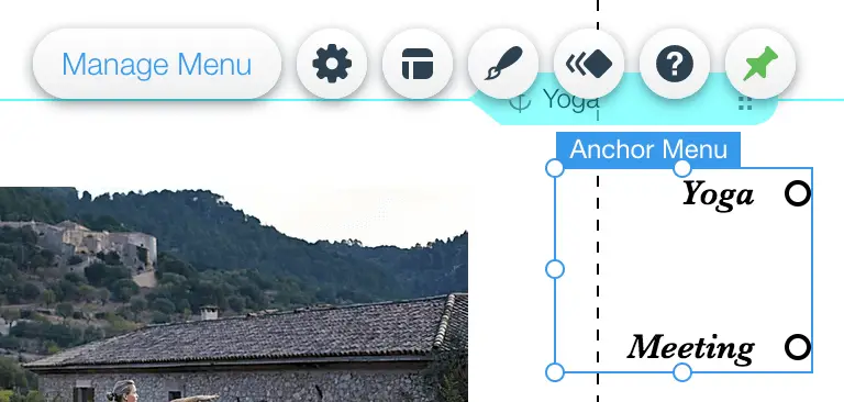
8.Create an Anchor Navigation Menu
The next step is to set up a navigation menu so that your visitors can jump to any section on the page with ease.
I want to point out one thing before you watch the tutorial video. One page website is simple and minimal. Your visitors can navigate by scrolling just fine. A navigation menu isn’t as important as it is in multiple page websites. But you should always have one. The reason is that first time visitors cannot tell if your site is a single page. If they don’t see a navigation menu, they won’t bother to figure out how your site works. And they will just leave your site.
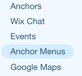
To add anchor navigation menu:
- Click “Add” icon
- Select “More”
- Select “Anchor Menus”
- Choose an anchor menu
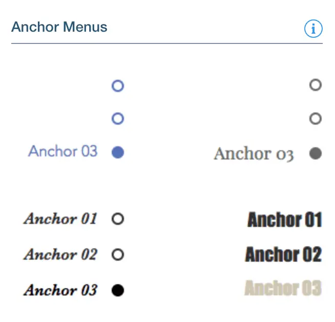
By default, Wix uses your anchor names to name the sections on the anchor menu. But you can change that. And the menu is positioned at the middle of the page near to the right edge of the screen. If you don’t like this position, you can move the menu to a different position.
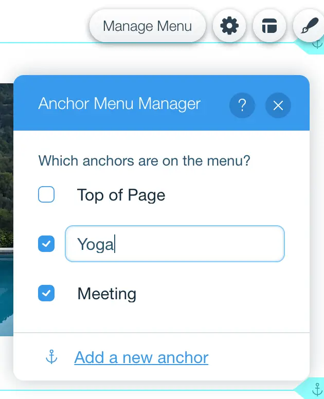
To change the section name on the anchor menu:
- Click “Manage Menu”
- Select the section and change name
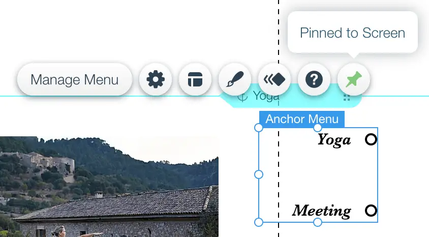
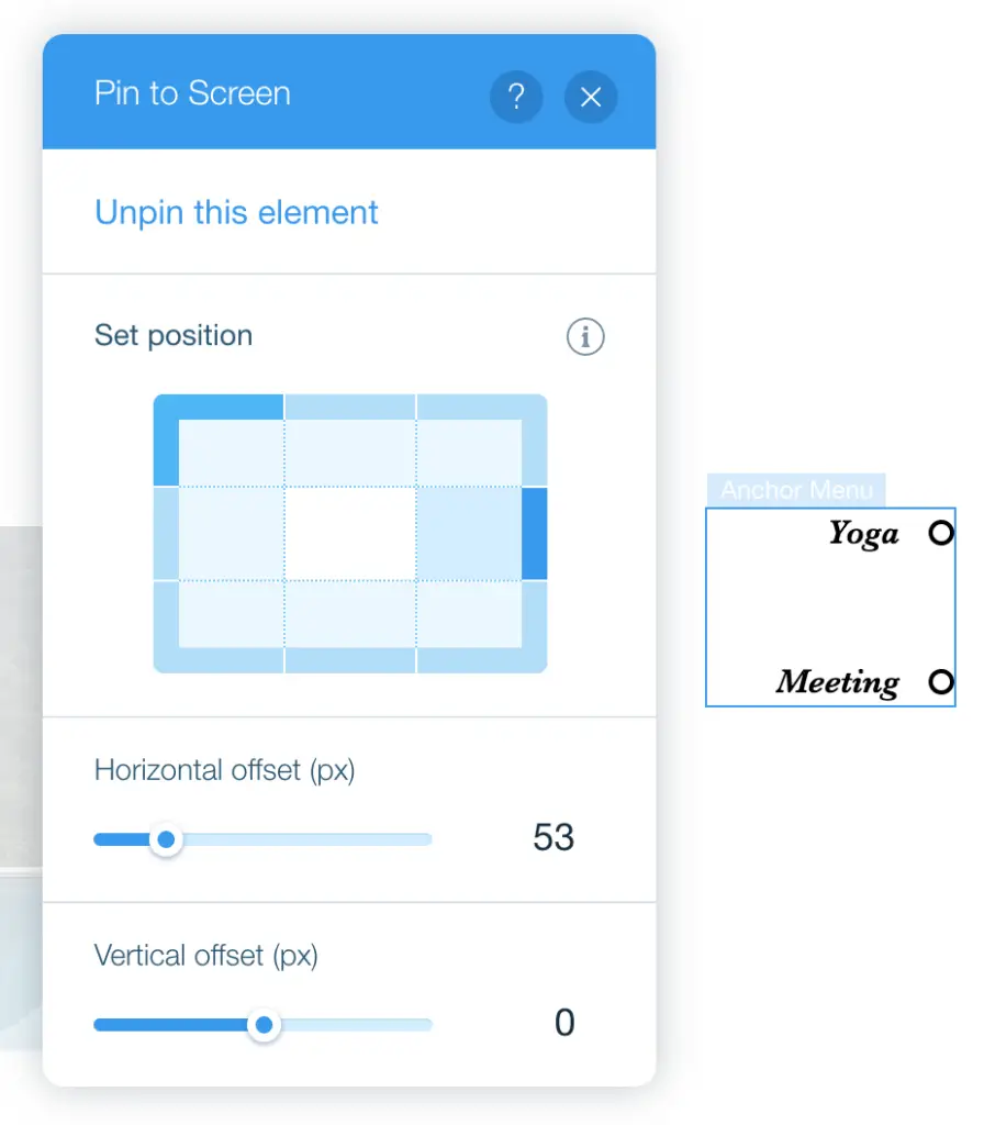
To move the anchor menu:
- Click “Pinned to Screens”
- Select the screen area to pin the menu
9.Add Back to Top Button
This is an optional step. In case your web page is way too long, you should add a “Back to Top” button. That button would bring the visitors to the top of the page. Then they can use the top menu to navigate to the sections again. The button will take your website user experience to the next level.
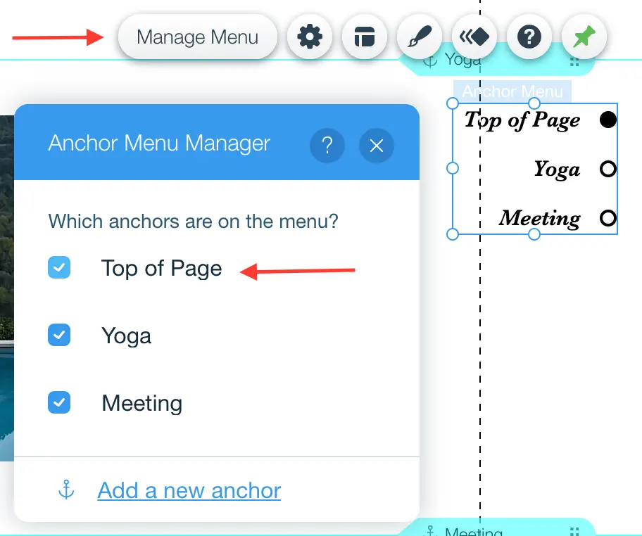
The good news is that Wix provides the “Top of Page” option in the anchor menu. It takes 30 seconds to witch it on. Follow the instruction below:
- Click “Manage Menu”
- Tick the “Top of Page” box
10.Add Parallax Effect
If you are a first time website builder, you are unfamiliar with this term. What is that? It is just an effect created by the uneven movement of the foreground and background images. The foreground images move faster than the background images. This movement creates a illusion of depth. The video below will show you the parallax effect.
Now you understand the parallax effect. If you still think you want it for your Wix site, follow the instruction video from Wix below:
11.Add Call-To-Action
The classic websites have so many pages. Sometimes you don’t know where to put the Call-To-Action so that you get the most result. One page website makes your life much easier. You only have two places to put it: below the header, or above the footer. Each has the pros and cons.
A Call-To-Action below the header
Your Call-To-Action has the most visibility near the top of the page. It is the first thing your visitors see when they open your website. That is the advantage. The disadvantage is that you haven’t yet convinced your visitors to take that action. Your visitors must scroll down and scroll away from your Call-To-Action to see your persuasive content. Many times it feels like a big ask to put the Call-To-Action near the top of the web page.
A Call-To-Action above the footer
The next ideal place for a Call-To-Action is the area above your web page footer. After a few minutes of reading your website content and understanding the values you would bring to the table, asking your visitor to take an action at this point is easy. The design and the content of your Call-To-Action at this point should be simple and straight forward. That is the plus point. The down side is that your Call-To-Action doesn’t get as much visibility as the one does at the top of the page. Some visitors scroll to the middle of the page and leave your site. Those visitors will never see your Call-To-Action near the bottom.
The good news is that you can insert your Call-To-Action at both places. However, you must put some extra effort into making the Call-To-Action near the top of the page. Your effort goes into summarizing the values your visitors would get from the action. Then you place the value summary text closer to your Call-To-Action.
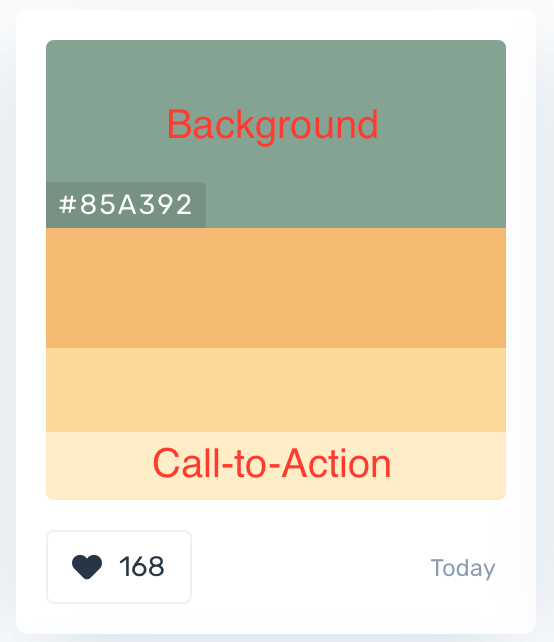
One more tip before you jump to the next section. You can increase the visibility of your Call-To-Action by using a color highly contrast to the background of the web page. Remember the color scheme in the section above? If your background is one color in the scheme, your Call-To-Action must be a different color in the scheme, and very contrast to the background color.
An example of excellent Call-To-Actions is below
Netflix

12.Enrich Your Site Footer
If anyone asks me what is the most important area of a one page website, I will answer without any hesitation, it is the footer area. Why is that?
When the visitors at the footer area of your page, most likely they see your entire web page. And they don’t leave your site. That means they are strongly interested in your business and your offers. Therefore, the footer area is where you make the “kill”. Or where you make the money.
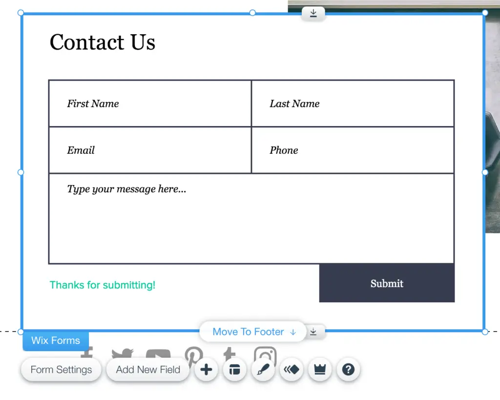
You learn from the above section that you need a call-to-action near the footer. I won’t repeat that here. Instead, I want to show you how to add social media accounts and contact form at the footer. They are important in case your visitors want to share your website on social media or contact you for more details.
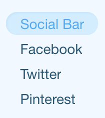
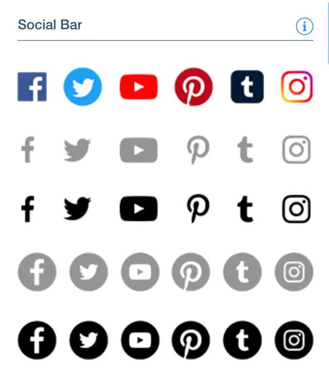
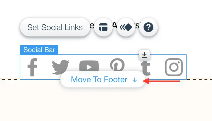
Add Social Media Accounts
- Click “Add” icon
- Select “Social”
- Select “Social Bar”
- Add a social bar from the list
- Move the bar to the footer

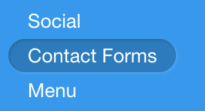
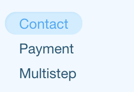
Add Contact detail block
- Click “Add” icon
- Select “Contact Forms”
- Select “Contact”
- Add a contact form from the list
- Move the contact form to the footer

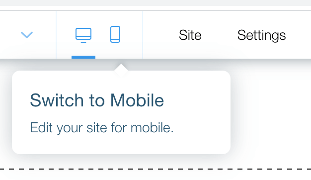
13.Make sure Your Site Work on Mobile Devices
A simple advice but a lot of people miss it. You often use a laptop to create your website. You see your website on a big laptop screen. And you adjust your website so that it looks good on the laptop screen.
But most visitors will use smart phones to check out your website. The phone screen sizes are much smaller than the laptop ones. So your site will look completely different on the phone screen. It may not look nice.
Therefore, you must test your site on the phone screen before you publish it. Wix editor has a mobile view. You can use that for editing your mobile site. Or you can pull out your phone and view your site.
14.Improve the Loading Speed
One of the most popular complaints from the single page website users is the loading speed. When you put everything (videos, pictures, music, texts, animated effects) on a single page, the internet browser has to load them all before your visitors can take a look. The larger the files, and the more files you have, the longer it takes to load. If the loading time takes way too long, your visitors will leave your sites. They have too much distractions nowadays.
Therefore, you must reduce your site loading time as much as possible. I have a few tips below. They will improve the speed of your site significantly.
Tip 1: Use lighter image formats.
High resolution images are nicer, but they take a long time to load. There are tools out there to help you reduce the image size without sacrificing too much quality. Or you can use web-optimized JPEG format instead of PNC format. Again there are tools to help you with the image file compression and conversion. I list the tools below:
_ Tiny PNG (free tool to compress PNG image)
_ Cool Utils (free tool to convert image to JPEG)
Tip 2: Switch off auto play mode.
You may have videos and music auto play on your site. This feels cool. But that cool is costly in term of times and data. The web browser has to download a lot of data so that the video and music players can play. Switch off those auto play modes, and you remove a ton of work from the browser. Your site will load much faster.
Tip 3: Remove unnecessary visual effect.
Visual effects also take a heavy toll on the loading speed. Therefore, you should minimize the visual effect. Remove as many visual effects as possible. Only keep the ones that you think your site cannot live without.
Conclusion
Single page website takes much less time to build and pleasant to use. Your visitors don’t jump from page to page like classic websites. Everything your visitors ever want is on one single web page. That is why I totally support you to build one for your business. I hope this article is helpful. If you have any question, leave a comment below. I will try to help out.